Case Study: Drop - Color Palette Creator
iOS Platform
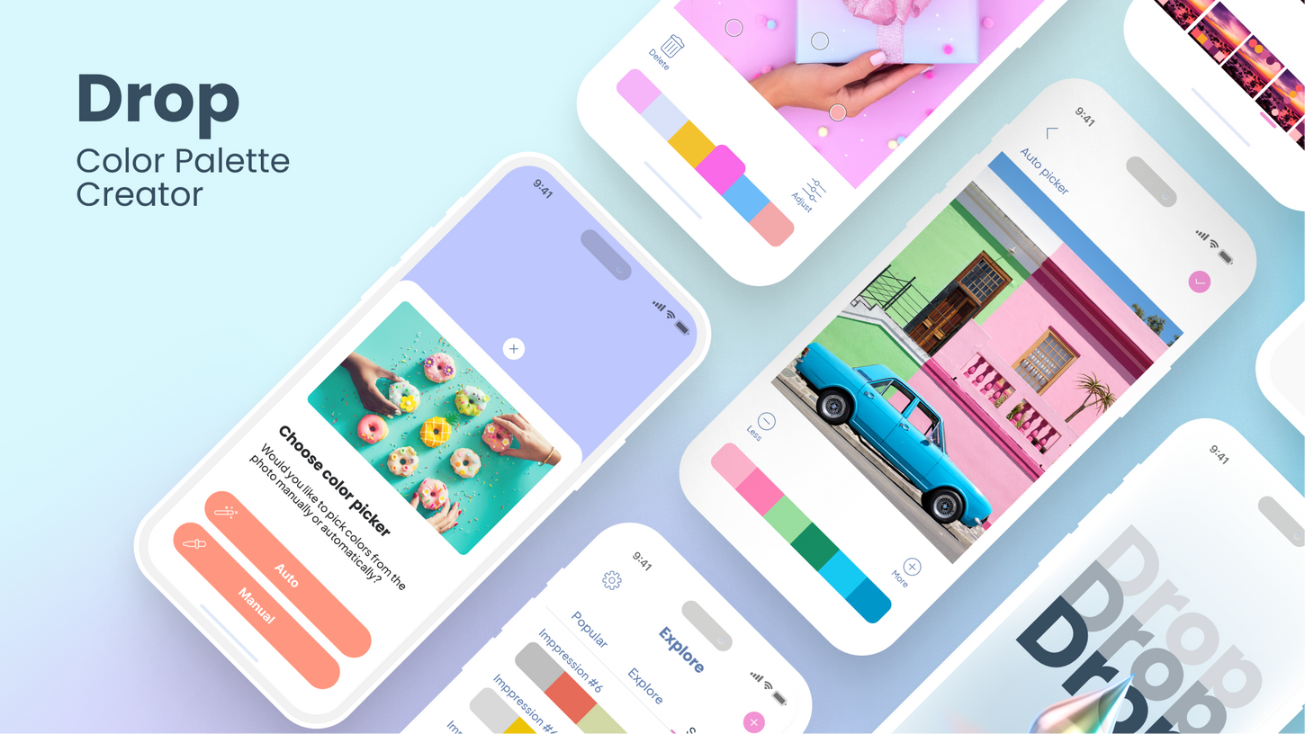
Drop is a color palette creator that allows users to create color schemes and combinations using any image they choose. The app has become increasingly popular among creative minds and individuals involved in design or art.
Problem
Creative people often struggle with finding the perfect color palette for their designs and photos. They spend countless hours exploring different color combinations, which can be time-consuming and frustrating. They need an easier and more efficient way to explore and create color palettes.
Solution
To solve this problem, I came up with an idea of a color palette creator app that allows users to extract color palettes from any image and experiment with different color combinations. The app offers various features, such as the ability to import photos from anywhere using the action extension, copy HEX color values to the clipboard, select photo gallery albums within the app, export color palettes as CSS, and share the palette on major social networks.
Key Decisions
-
Import photos: I decided to include the feature to import photos from anywhere using action extension, making it easier for designers to use images they already have.
-
Copy HEX color values: To make the app more convenient, I added the ability to copy HEX color values to the clipboard, allowing designers to easily use the colors in other applications.
-
Select photo gallery albums: I added the feature to select photo gallery albums within the app, making it more convenient and efficient for designers to access their photos.
-
Export color palette as CSS: To make the app even more useful, I included the ability to export color palettes as CSS, enabling designers to use their palettes in their designs.
-
Color adjust: I included the color adjust feature to allow designers to adjust the colors they have detected in photos, making it easier for them to get the exact color they need.
-
Share on social networks: To encourage collaboration and inspiration, I added the ability for designers to share their color palettes on major social networks.
Impact on Users:
-
Convenience: Drop has made it easier for users to create color palettes and use them in their designs. With the ability to import photos, select photo gallery albums, and export palettes as CSS, users can save time and effort in their creative projects.
-
Increased creativity: The app's ability to detect colors in photos manually or automatically, as well as its color adjust feature, has allowed users to explore new color combinations and bring more creativity to their work.
-
Improved color accuracy: With the ability to adjust colors and obtain RGB, HSV, and CMYK values for each color, users can achieve better color accuracy in their designs.
Result
The result of my efforts is a user-friendly and efficient color palette creator app. Drop has become popular among creative minds and individuals involved in design or art, making it easier for them to explore and create color palettes. The app's ability to detect colors in photos manually or automatically, as well as its color adjust feature, has allowed designers to bring more creativity to their work.
The app has made the process of exploring and creating color palettes more efficient and enjoyable, and has become a valuable tool for designers looking to bring more creativity to their work.
Drop
Color Palette Creator
Icon
The goal of the icon design was to create a recognizable symbol for Drop App, a color palette creator that allows users to create and save unique color combinations. The icon needed to be simple, clean, and easily recognizable, even at very smaller sizes.
Design Process
The first step in the design process was to research and analyze existing color palette creator icons to gain a better understanding of common design elements and trends. The research showed that most icons used simple shapes, such as squares or circles, and used a single dominant color.
The next step was to create several rough sketches. I have extensively explored different approaches in icon design to ensure that the icons I create effectively communicate the intended message. This involved experimenting with different symbols and techniques to find the best solution for each project. The sketches were then reviewed and refined, taking into account the design brief, research and feedback from the design team.
I selected a droplet icon that was simple yet impactful. The droplet was chosen for its aesthetic appeal and effective communication of the intended message. It also inspired the application's title, tying the design together in a meaningful way. The drop icon was designed in blue color shades and the background was black. The blue color was chosen as it is often associated with water and fluidity, which fits with the idea of a droplet. The black background was used to provide a clear contrast between the drop and the background, making the icon easier to recognize.


